FanFunds — Donation App for Creators
A donation app for creators, built as the MSIB Batch 7 independent-study capstone — covering user personas, user flows, a design system, and A/B testing with 30 respondents.
01. Project Overview
FanFunds is a donation app for creators: supporters find creators, give support, then see where they stand on the leaderboard. It was the MSIB Batch 7 capstone at BISA AI Academy, where I contributed as UI/UX Designer.
02. Problem Statement
Donation apps often stop at a single completed transaction. The challenge was making support feel like an ongoing relationship between creator and supporter — through creator updates, notifications, and a leaderboard.
03. User Research & Insights
My research contribution covered building the user personas and user flows the design rests on, followed by A/B testing with 30 respondents to compare design variants.
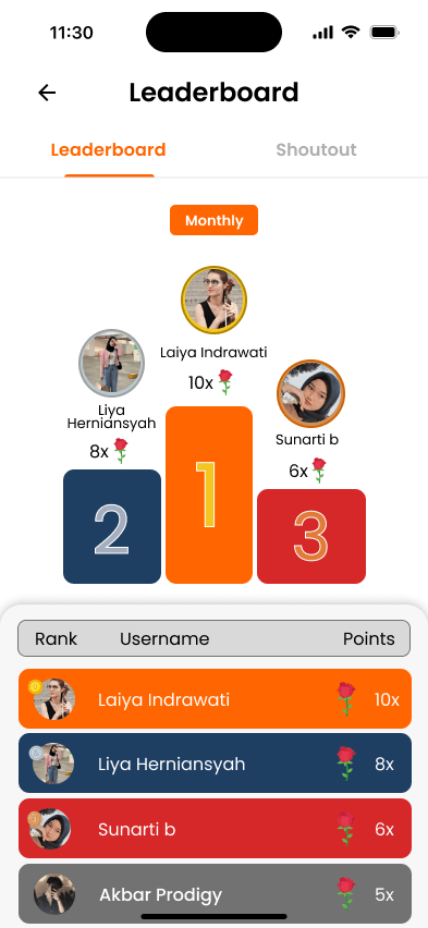
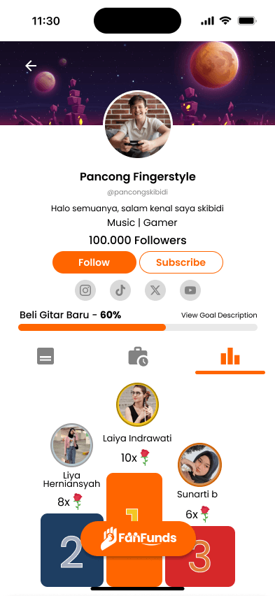
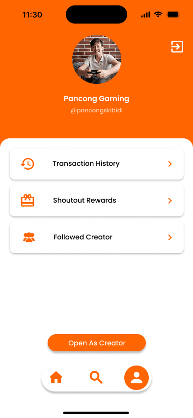
- A donor's standing should be visible from the profile page, not only in the global leaderboard list.
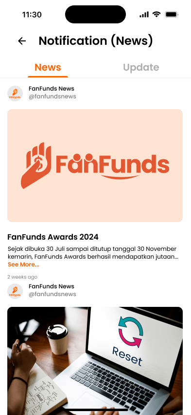
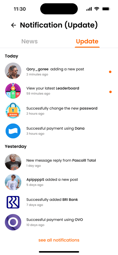
- Notifications separate creator updates from news about other donors, so the two never blur into one message type.
04. Define & Strategy
The experience splits into three axes: finding creators (discover), giving support (donate), and tracking the impact of that support (leaderboard and notifications).
05. Information Architecture & Flow
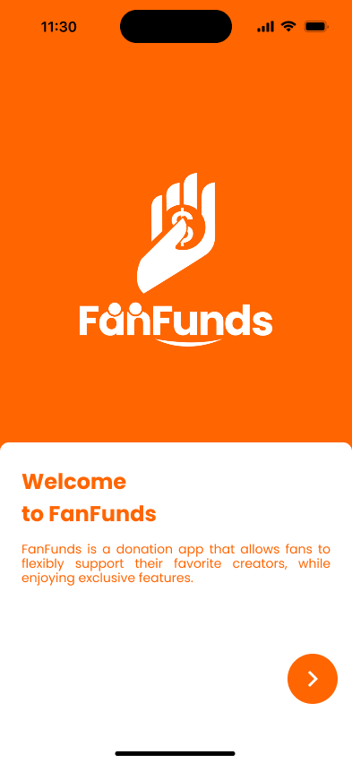
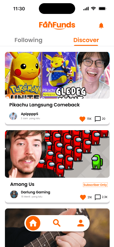
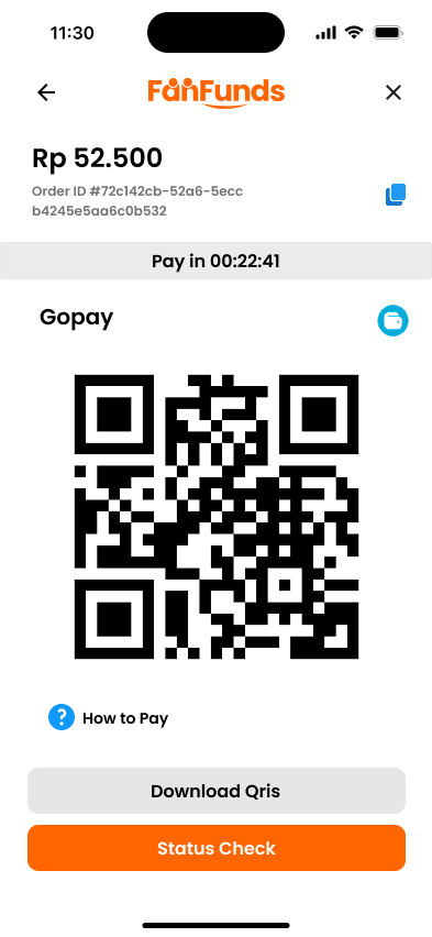
Splash → Onboarding → Home (Discover / Following) → Search → Leaderboard → Creator Profile → Supporter Profile → Donate → Notifications. Donor: onboarding → discover → choose a creator → tiered donation → confirmation. After donating, standing and support history appear on the supporter profile and the leaderboard.
06. Wireframing & UI Design
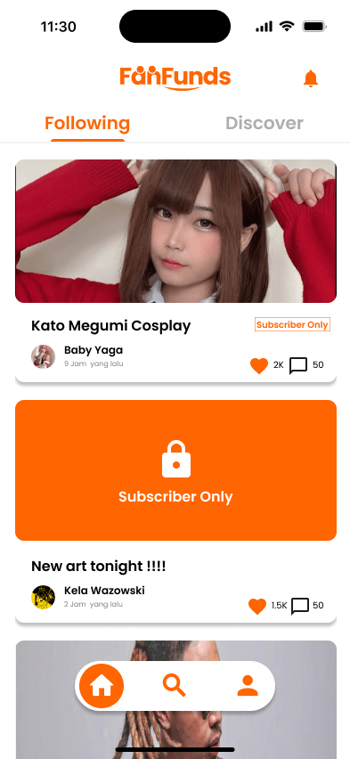
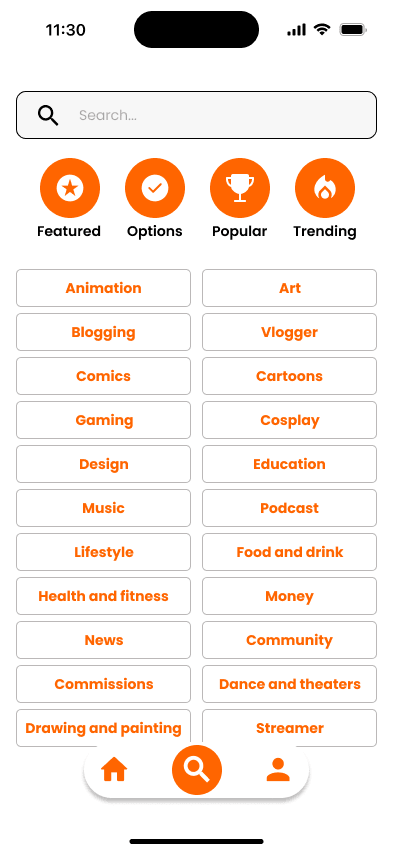
The home, explore, payment, and leaderboard screens were designed in Figma alongside the project design system. Button, creator-card, and donation-progress components are reused across screens to keep them consistent.
07. Usability Testing & Iteration
A/B testing ran with 30 respondents to compare design variants before finalisation.
08. Final Result & Impact
Eleven screens: splash, onboarding, two home variants (discover and following), search, leaderboard list, creator profile, supporter profile, the donation steps, and two donor notifications.
09. Personal Reflection & Learnings
Working in a capstone team got me used to handing over design-system components, not just design files.